New York City Redlining Poster
This poster investigates how contemporary hownership rates across New York City are reflective of housing discrimination and redlining from the 1930's
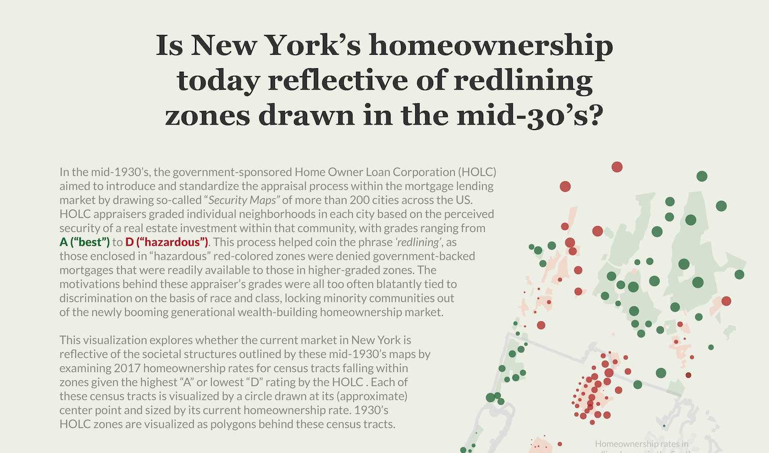
In this data visualization poster, I examine where the current homeownership landscape in New York City reflects the societal structures dictated in mid-1930's redlining maps, which served to exclude minority and low-class neighborhoods from the burgeoning mortgage market in the New Deal era United States.
Process
My early concept designs for this poster used a small multiples approach with separate maps for each redlining grade and a linear gradient representing current homeownership levels
I then explored only including the highest and lowest rated zones, playing with how I could use the same color palette for categorical grades and homeownership levels
The small multiples made each map a bit too small on the poster, so I decided to have one map occupy the whole page with only the highest and lowest graded zones colored in...
...and chose to have color represent only the categorical redlining grade, using size as a new retinal variable to display homeownership for census tracts within each neighborhood
I built on this design to maximize the size of the map and add a title, description, legend, annotations, and data source to the poster, along with a taupe background color
Data Source: Mapping Inequality project / US Census ACS 5-Year Data (2009-2017) / 2010 US Census cartographic boundary file
Tools: Adobe Illustrator / CSS / d3 / HTML / JavaScript / Pandas / Python / Shapely / SVG Crowbar
Data
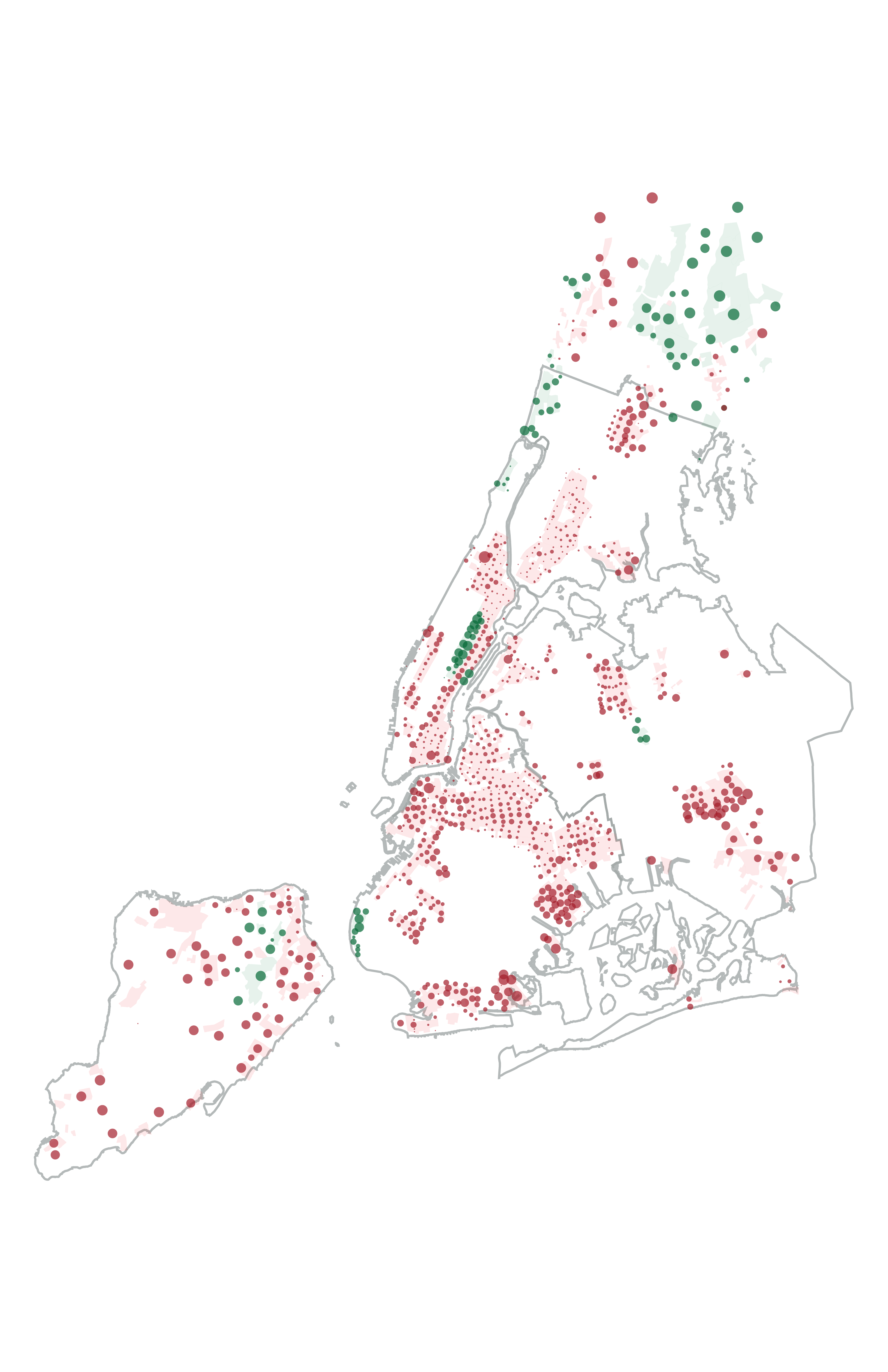
There were two main data sources in this project: redlining maps for all five New York boroughs and lower Westchester county from the Mapping Inequality project, and census data from the American Community Survey (ACS) 5-Year Data (2009-2017) with census tract boundaries from the US Census' 2010 Cartographic Boundary Files. I first calculated homeownership rates for each census tract in New York, along with estimating a tract's center point by taking an average of the latitudes and longitudes across that tract's boundary points from the cartographic boundary file.
Since I wanted to connect grades from the 1930's redlining map to current census data to explore if redlined areas had lower homeownership rates today, I needed to join these two geographic data sources. The main challenge here was comparing the location of each census tract with the neighborhood boundaries from the redlining map, attributing a redlining grade to each tract. I approached this problem by detecting intersections between census tract boundaries and redlining neighborhood boundaries with the Shapely python library. If a tract intersected with a redlining neighborhood, I assigned that tract that neighborhood's grade. If a census tract instersected with mutliple neighborhoods, I would manually determine which neighborhood that tract's centerpoint looked closer to and assign it only that one grade.
After completing this process, I explorted a GeoJSON file with geographic centerpoints, homeownership rates, and redlining grades for each census tract encompassed within New York City redlining maps. Using this data alongide boundary files for each redlining neighborhood and borough, I then wrote a script in d3 to draw SVG's of all my redlining neighborhoods and census tract dots. I used SVG Crowbar to save static copies of these SVGs from that webpage that I could then bring into Adobe Illustrator to create my final poster design.
Visualization
The title and intial descriptive text gives the poster necessary context behind the complex topic the graphic is addressing. By ragging the descriptive block of text against the shape of the map next to it, I maximize space on the poster while visually framing the poster's main graphic. I also use bold color within this description to communicate the meaning of these colors, which are used throughout the poster, while breaking up visual monotony within the text.
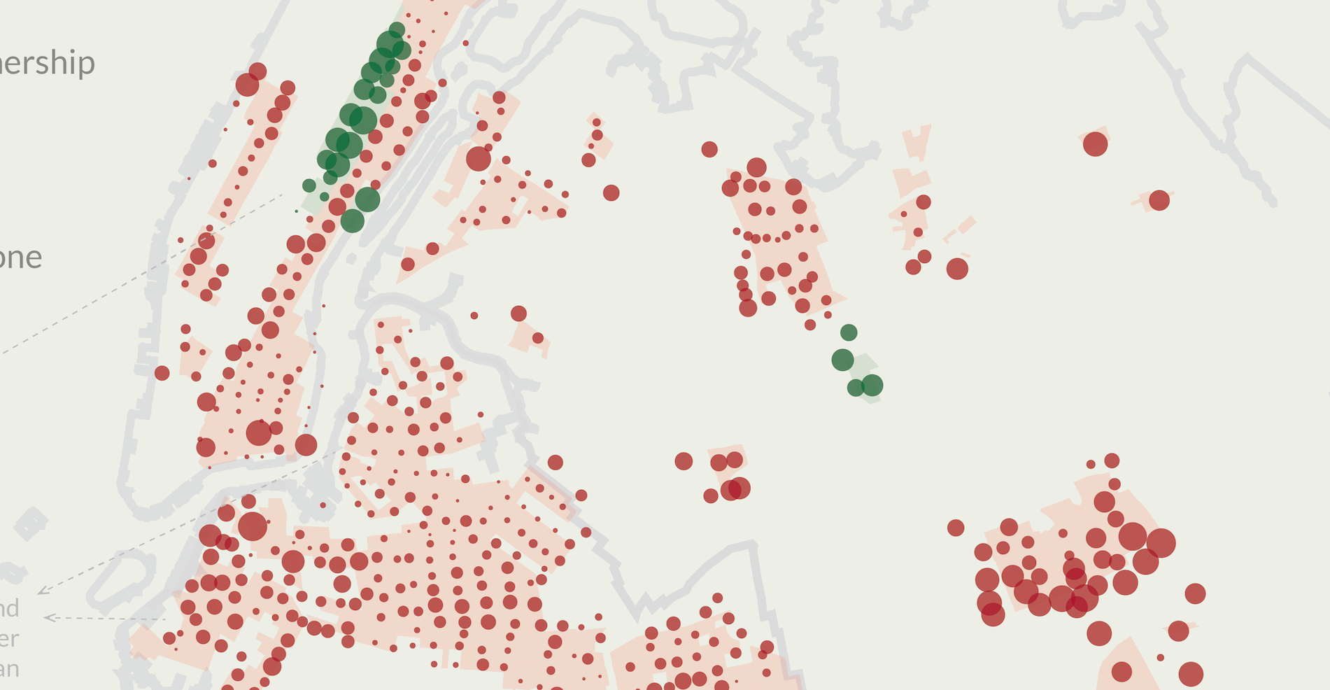
Each tract is represented by a circle centered on the tract's approximate midpoint, with size delineating homeownership rate and color delineating redlining grade. This approach visually highlights broad differences in homeownership rates across neighborhoods and emphasizes clusters of tracts with divergent homeownership rates. I only included the highest and lowest rated neighborhoods from the redlining maps, foregoing the two middle grades, since I wanted to simplify the poster's narrative while avoiding a cluttered visual.
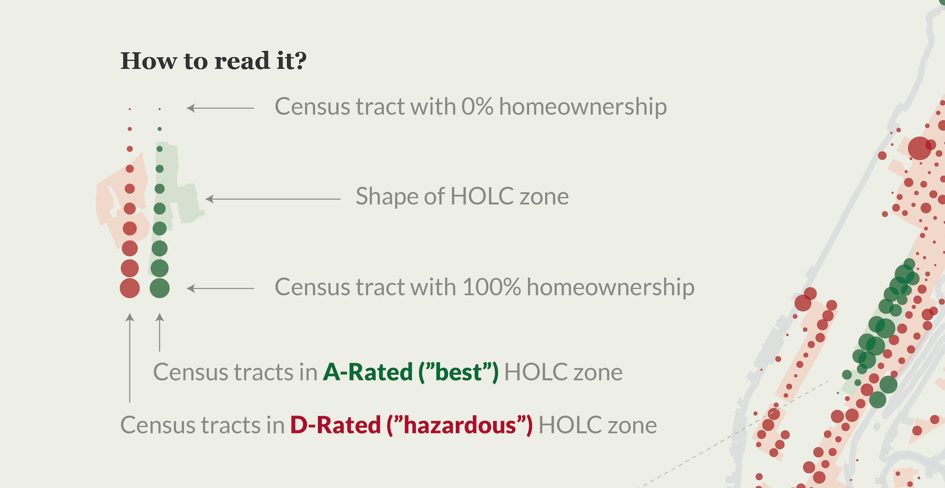
A visual legend inspired by Giorgia Lupi and Accurat explains how to read the poster's detailed visual language in an aesthetically appealing, illustrative approach.
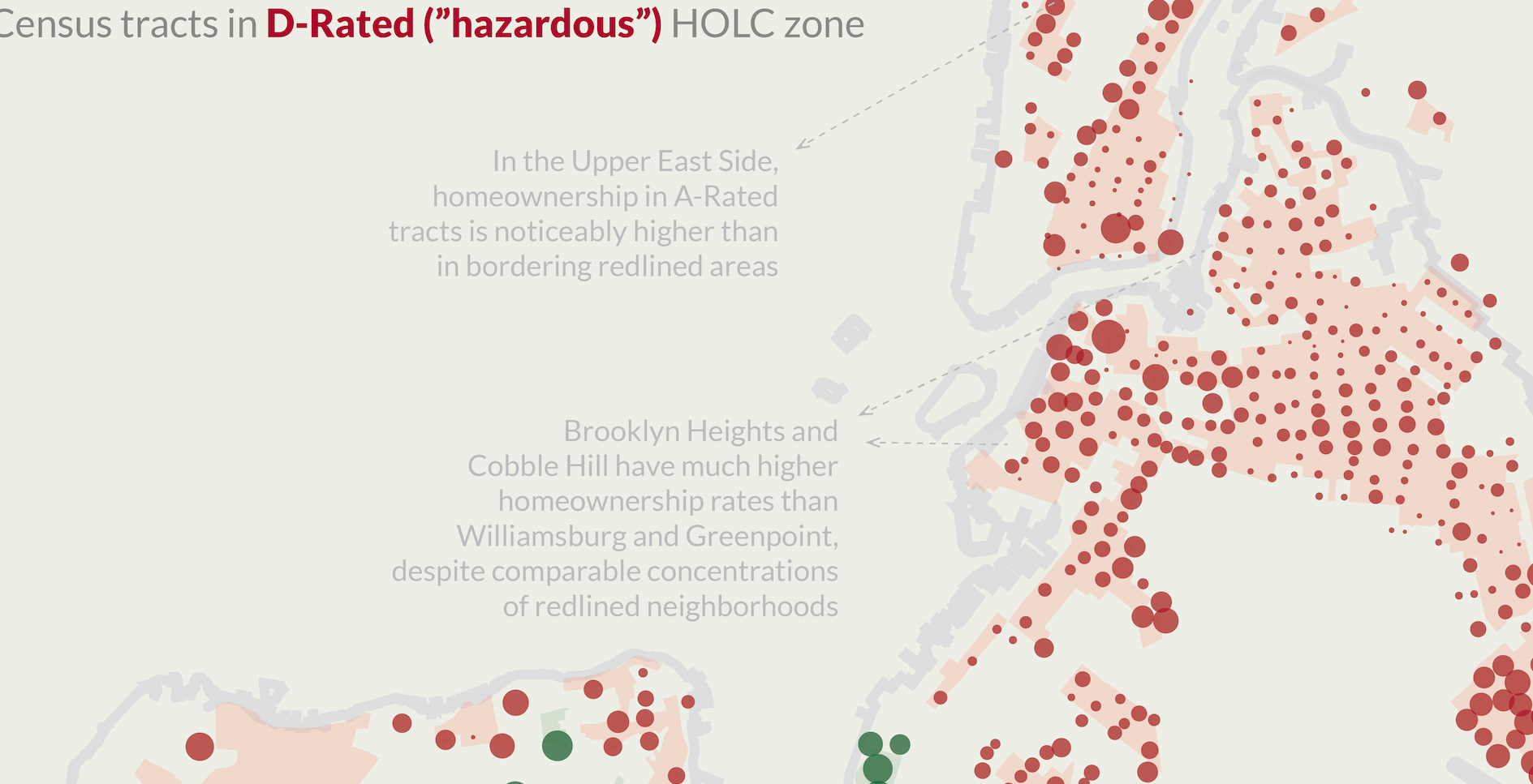
Annotations throughout the poster offer insights about specific neighborhoods for those who want to spend time investigating the graphic in detail.
Detailed information about the data sources and methodology are included in the lower right hand corner of the poster, without detracting from the graphic or the poster's insights.
--Personal Project--
samia.design
Like this project? Want to get in touch? Reach out!