The Migration of Art
This visualization explores how artwork travels across the globe through ownership changes and exhibitions, focusing on The Met's collection of Van Gogh paintings.
How does art travel across the globe before it arrives in a museum gallery? When was it bought and sold, and by whom? When and where was it sent on exhibition tours?
Studying an artwork's rich history of movement is crucial to understanding how the world interacted with a piece, along with how it influenced the broader world of art and human culture. While a student of data visualization at Parsons School of Design, I worked with wonderful partners at The Metropolitan Museum of Art to explore these questions in an interactive visual context, utilizing both abstracted visual timelines and animated mapping to follow the museum's collection of Van Gogh paintings through their travels from creation to their current location at The Met.
Process
My first sketch laid out the project's general concept: using animated mapping to show how The Met's paintings traveled the world over the course of their history
I then started exploring how to maintain a visual of past movements on the screen, creating a full timeline of movement that marked when a piece moved from place to place
I also experimented with ways to provide a more info-rich timeline that shared screenspace with the map and didn't require a hover action for location and ownership detail
My first interactive prototype prioritized the animated map and used colors from the piece in that map, as the timeline became secondary to watching the piece zig-zag around the globe
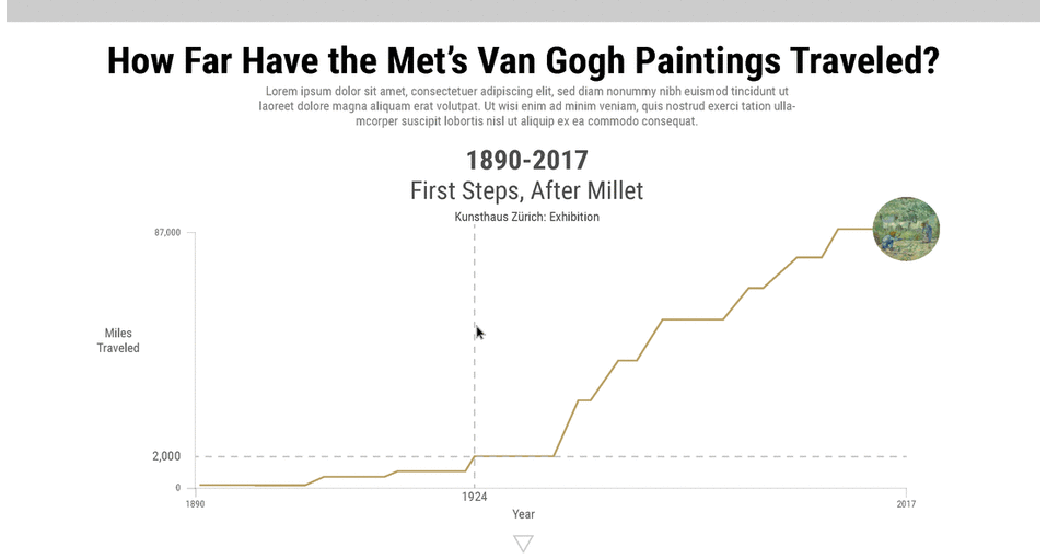
The next stage of my design explored new avenues to represent the overall movement of each painting beyond a map – here seeing how a piece's total distance traveled progressed over time
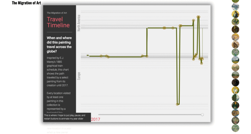
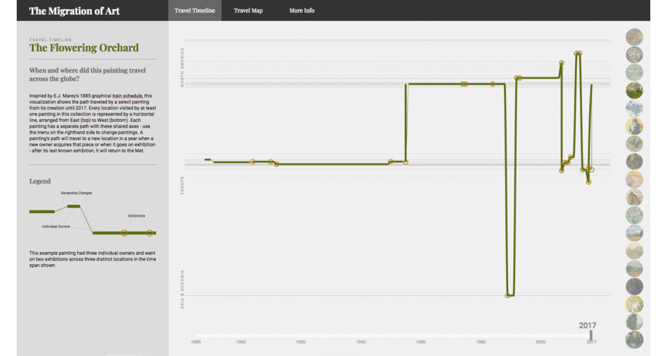
I took inspiration from EJ Marey's train schedule graphic to sketch an abstract timeline of movement for each piece, which wound up being the foundation for my final project's primary visualization
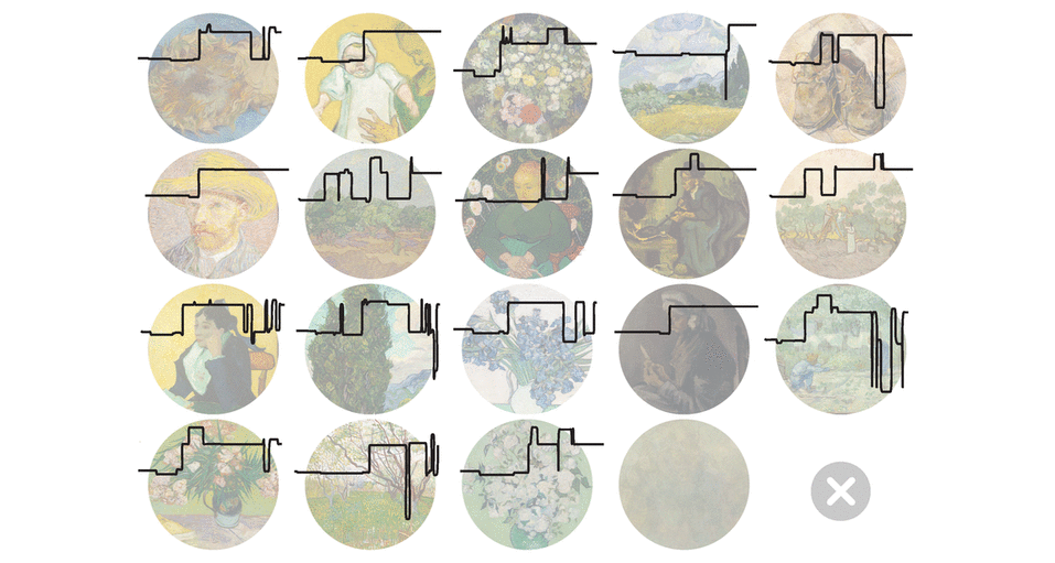
I then explored looking at ways to represent the whole collection at once, here using a small multiples approach represent the differences between the histories of each piece...
...and here combining all paths into one map – I ended up forgoing showing all paintings at once to avoid cluttering the page and to prompt more user exploration of each painting's history
Focusing on individual pieces, I then attempted to use multiple graphics to visually extrapolate ownerships and exhibitions, but ended up being a bit too duplicative and scattered
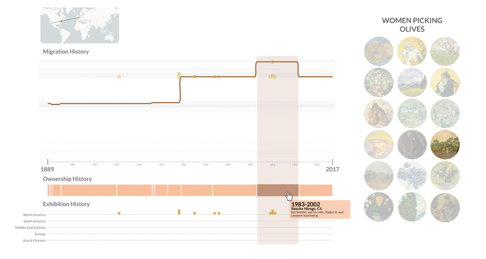
I visually condensed this disorganized visual, differentating ownership tenures by thicker line segments connected like sausage links and exhibitions with circles colored within the painting's palette
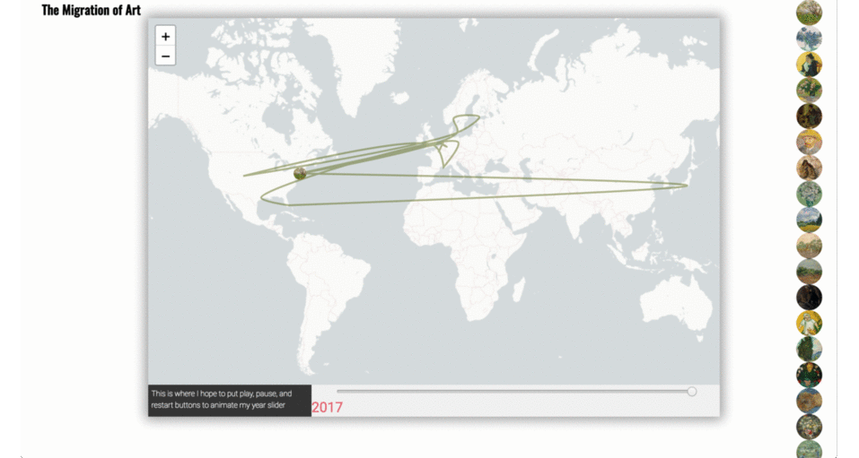
I decided to prioritize the timeline but didn't want to lose the map entirely, which is an engaging animation that helps ground the abstract timeline, so I placed it in its own secondary pane
The final design dedicates more screenspace to our main graphic and softens the colors of side menus and legends, visually emphasizing the project's primary visualiation
Partner: The Metropolitan Museum of Art
Data Source: The Met Collection API
Tools: Adobe Illustrator / CSS / d3 / HTML / JavaScript / Leaflet / Node / Pandas / Python / Sketch
Data
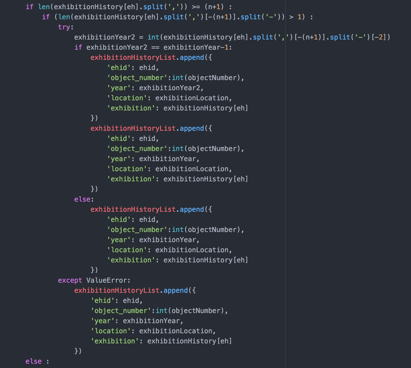
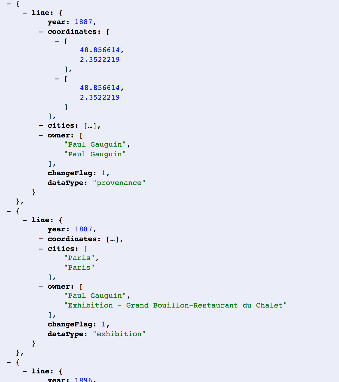
The main data challenge in this project was how to parse ownership and exhibition histories, which are organized as separate paragraphs and lists in the Met's API and front-end webpage, into one cohesive story of movement for each painting.
After pulling down each provenance paragraph and exhibition history from The Met's API into static text files, I needed to split the paragraphs of provenance text into individual unique ownership tenures, associating each owner with the location listed and their timeframe of ownership. Exhibition histories, stored as html lists, were a bit more straightfoward to organize into data structures. I then joined these exhibitions and provenance structures together to craft an exhausted travel timeline, logging the location of aeachpainting in each year from creation through 2017 (the most recent data available at the time of data collection). In my timeline model, a painting moves locations any time it was acquired by a new owner or went on exhibition; after a painting's last exhibition, it returns to The Met.
I used python to pull HTML text from the Met API and the pandas library for data processing and organizing, which I then exported as JSON files that are picked up by my front-end visualization.
Visualization
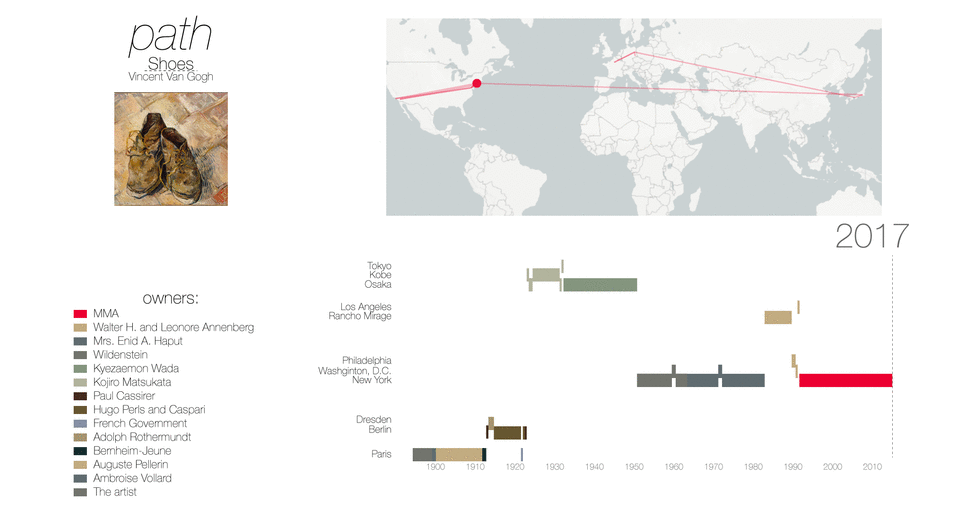
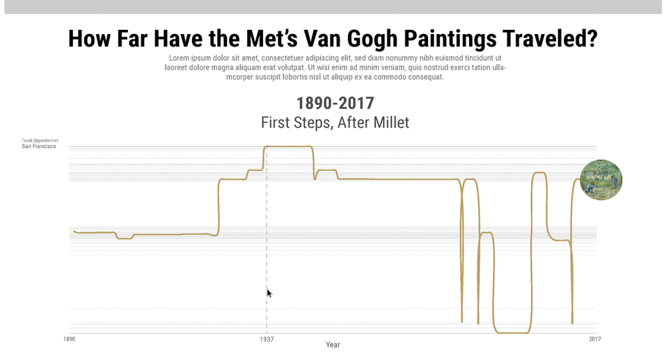
This project's visualizations needed to contain multiple layers of dense, rich information; how can we show the entire history of each painting's movement while distinguishing ownership changes and exhibitions in a concise and aesthetically appealing visual? My primary solution for this challenge was an abstract travel timeline, inspired by E.J. Marey's 1885 graphical train schedule.
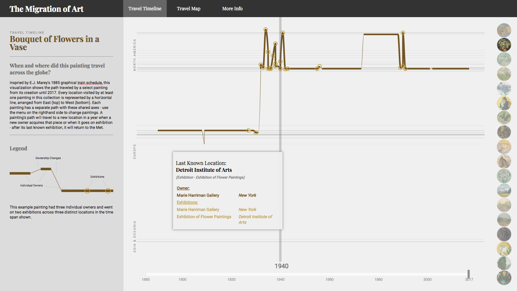
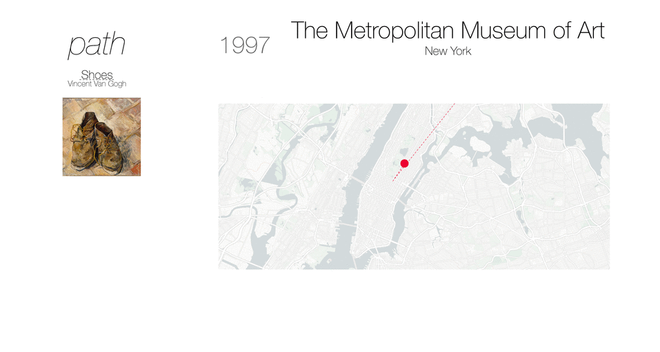
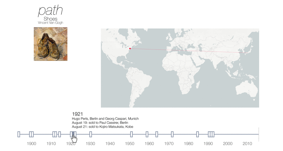
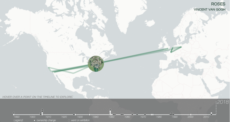
This visualization and the corresponding axes themselves tell a detailed story about each piece and the collection more broadly. Each location visited by at least one painting in our analysis gets a horizontal line on our y-axis, arranged from east (top) to west (bottom). This allows our axis to provide its own insight, giving us to get a relative sense of where this collection as a whole traveled - and where it didn't. Our x-axis starts when the first painting in our collection was created, in 1885, through to our most recent data in 2017. This shows us where each piece traveled during each year in its lifespan within the context of the collection as a whole. These axes stay consistent throughout each iteration of the visualization, facilitating quick and easy comparisons across paintings.
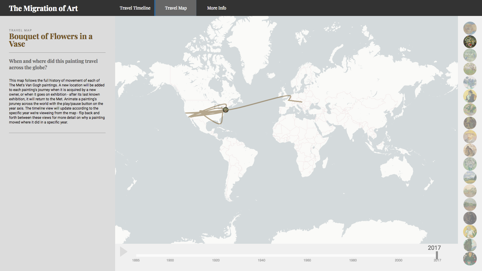
This abstract timeline is supported by our map view, showing the path each painting traveled across the globe from its creation through 2017. Through animation we can watch the whole journey from start to finish or walk through each year of this journey one by one, following along with these travels in real time.
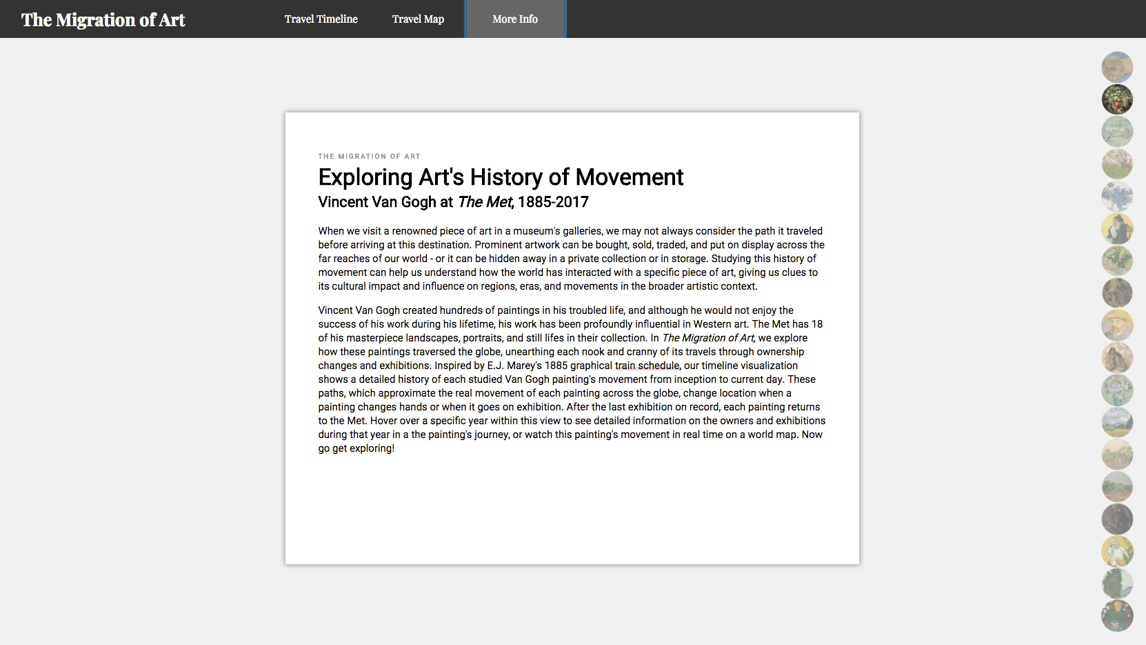
I also provide a tertiary level of information for those users that may be interested in the broader context on the inspiration and impetus of this project, reminscient of the placards placed next to each painting on the walls of a museum.
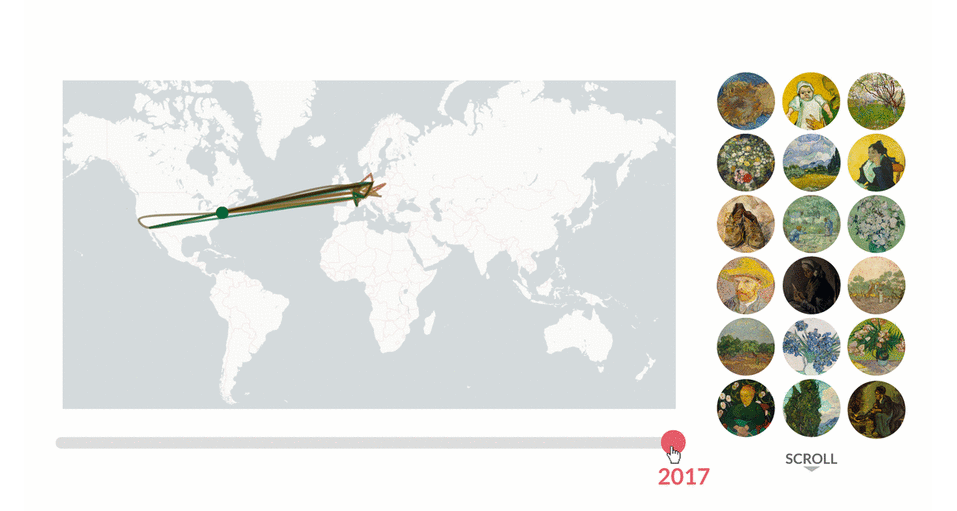
We welcome our users with a friendly animation that also orients us to the project's concept of following the movement of each painting from place to place. These animated paintings will also become the menu with which we navigate and filter the project's main visualizations.
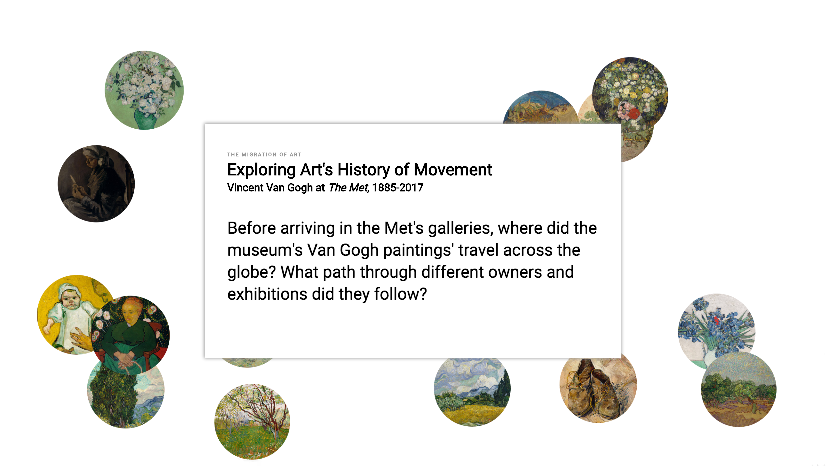
A concise introduction orients us to the context of the project, matching the museum placard style of our more detailed project info view.
I needed to design a new interface and visualization more attuned to the constrained screen and wholly different methods of interaction required on a mobile device. The orientation of our main visualization and painting menu are rotated to better utilize scrolling. A collapsable menu allows our users to decide which view to show, along with the level of detail available at each data point while they scroll. Project information and visual legends are also accessible behind this menu.