Sub Data Dashboards
This suite of Tableau dashboards built for Substantial Classrooms helps school districts understand the landscape within their substitute teacher systems.

Substantial Classrooms aims helps school districts improve the substitute teaching experience for everyone involved: students, subs, teachers, and district personnel. Foundational to their approach is allowing exploration of the data that comes from the software these districts use to manage their substite teaching system. District personnel often do not have the time or expertise they need to find useful insight from this rich information. Substantial helps fill this gap, providing understanding on how their substitute systems operate, who their subs are, and what challenges they face.
Substantial contacted me to help build a suite of low-lift Tableau dashboards that would facilitate this process, providing quicker and more accessible insight to district leaders on the state of their substitute teaching system. These Sub Data Dashboard visualizations allow districts to prove (or perhaps more importantly, disprove) their key assumptions about how their system operates, helping them make improvements in filling the most teacher absences they can as quickly as possible.
Process

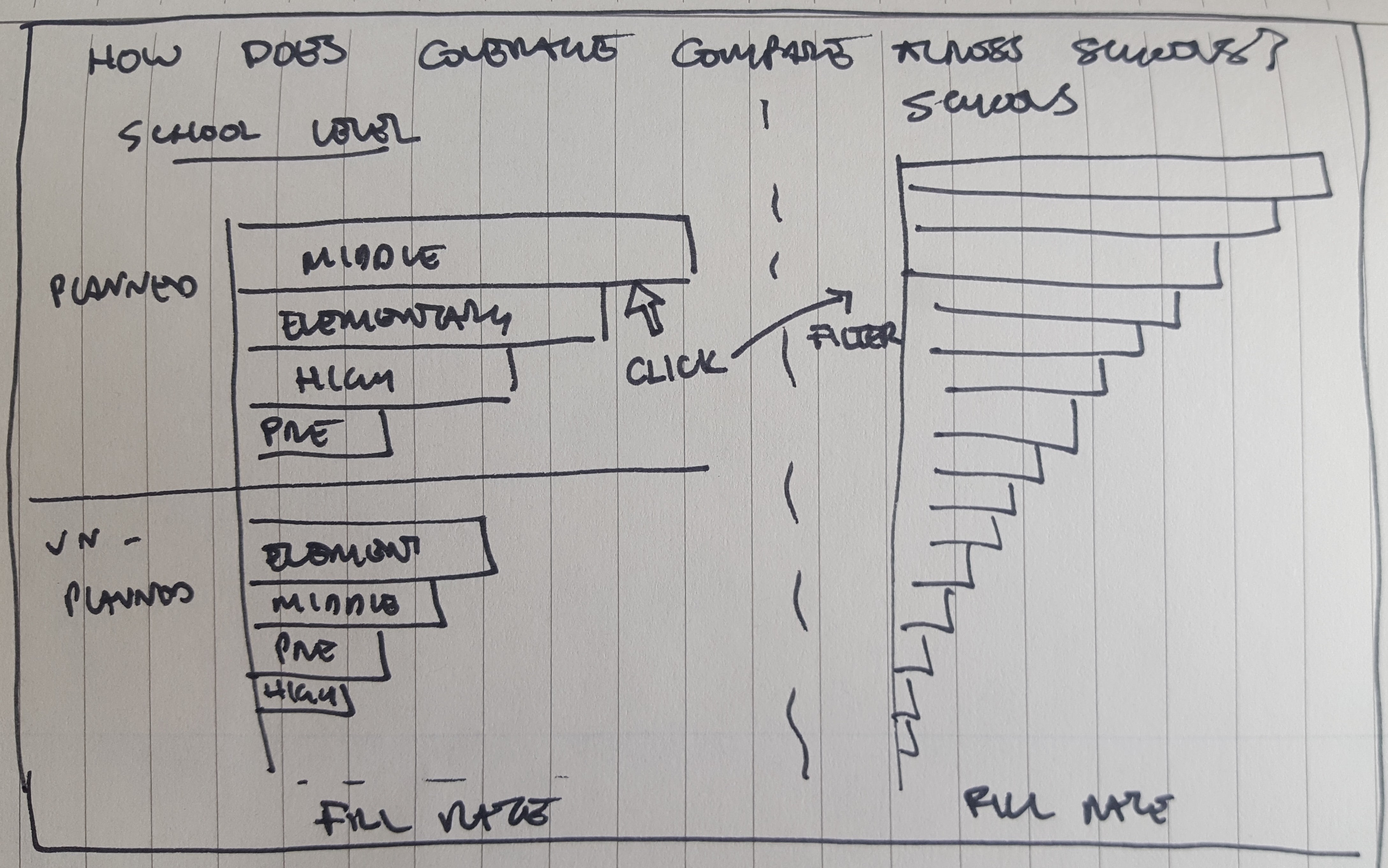


I skteched early-stage designs with pen and paper, which helped to organize my thoughts around how my visualizations would answer key analytical questions and allowed me to easily communicate this vision to Substantial.
Client: Substantial Classrooms
Data Source:Sample anonymized export from TalentEd SmartFind Express absence management system (formerly eSchools SmartFind)
Tools: Excel / Paper Prototyping / Tableau
Data
Substantial Classrooms needed their visualizations to work with data that districts export from their partner districts' absense management software, so they provided me a representative sample of what these data exports look like from the TalentEd SmartFind Express system (formerly eSchools SmartFind), one of two main systems their partner districts use.
This sample data set had one row per sub request and provided key characteristics of each request, including: the status of each vacancy (was it filled or left unfilled?), the type of the request (was it pre arranged or last minute?), where the substitute was requested (at which school/location?), the timing of each vacancy (when did it start and end?), and identifiers of the teacher and substitute involved (if the vacancies were filled).
Since Substantial would own the process of generating new versions of dashboards with updated data, I wanted to minimize their steps between exporting data and providing insight. To streamline this process I opted to forego any data manipulation before bringing these data into Tableau, instead leveraging the flexibility of the software to add any necessary calculations and aggregations once the data was imported. In this way, Substantial would just need to replace the data source within the template once new data was exported to quickly deliver a new report to a partner district.
Visualization
Substantial's biggest priorities for these visualizations were ease of use and actionable insight. They wanted busy district leaders to be able to answer a set of strategic questions in a digestible and visually appealing manner without needing technical expertise to understand their data. I took a very pragmatic approach to these dashboards to reflect these priorities, providing simple visualizations that answered these questions as clearly and quickly as possible.
The Sub Jobs Overview dashboard answers the questions:
- How many sub days were requested in my school(s) this year? What percent of these days were filled?
- How did my request volume and coverage rate compare across job categories and reason for request?
Our simple bottom-line statistics in text and percent-of-total donut chart allow us to quickly provide a high-level snapshot for the current school year as a whole. Organizing coverage across job categories and request reasons in bar charts allows for quick comparisons and rankings of values within these fields in a straightforward, familiar visual. These bars also provide click-to-filter functionality on the other charts in this view (with instructions on this functionality and more detail provided in a hover-over tooltip).

The How Does Coverage Compare Across Schools? dashboard answers the questions:
- How did coverage rate compare across job categories within a school level?
- What was coverage rate in specific schools? What about coverage rate for schools within specific school level(s)? Job categories within these?
Again we use bar charts for a quick and easy comparison of coverage rates across different levels of detail and different categories. Substantial applies a three-tiered category at the school level: high (>90% of days filled), medium (between 67% and 90%), and low (<67%). We represent this distinction here by applying the familiar green-yellow-red stoplight palette to our school-level chart, creating visual tiers of school based on substitute coverage levels.
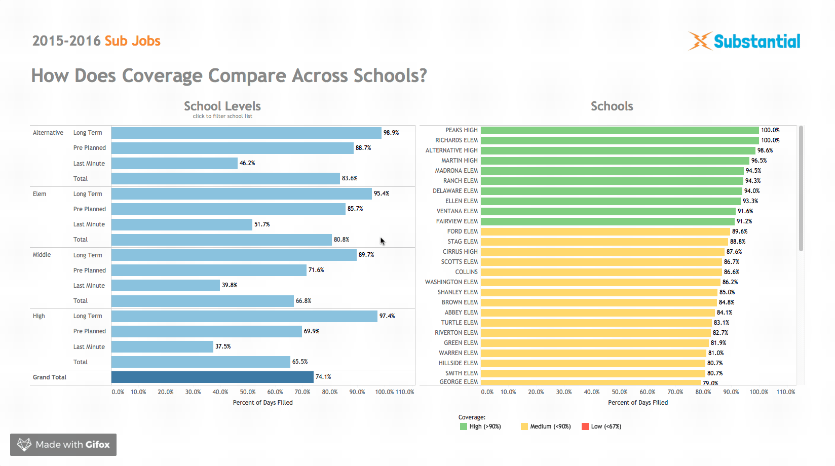
Dynamic filtering allows us to whittle down our list of schools by level, or to see the differing coverage rates by job category in each school. This interactivity empowers excited district leaders to take an active role in exploring their data, exploring its nooks and crannies to find the insight that matters most to them.

The How Does Coverage Compare Over Time? dashboard answers the questions:
- How has my number of sub days requested and coverage rate progressed from month to month this school year? Across different days of the week?
- How do these results change for a specific job category?
This dashboard implements a stacked area chart to represent change over time for two metrics simultaneously: the overall number of days requested and the rate of filling those requested days with subs. We use the same color scheme as our donut chart from the Sub Jobs Overview dashboard (blue days fill in the gray total). Carrying this visual language throughout our dashboards provides consistency and reduces the amount of effort needed to understand this new chart. We also implement light-touch filtering, allowing exploration on what these trends look like across the different schooldays or how this chart changes for different types of requests.

The Who Are The Subs In My District? dashboard answers the questions:
- How many subs worked in my school(s) this year?
- What assignment channels were most popular? Least popular?
- What percent of my subs were "top subs" (worked at least 30 days) this year?
- What proportion of total days worked were accounted for by my “top subs”?
Here I implement familiar, simple data representations alongside the most complicated visual throughout this suite of dashboards to give detail on the substitutes teachers themselves. I provide the highest-level of detail most simply, with the overall number of subs who worked in a district represented in text reminscient of the style used in our Sub Jobs Overview dashboard. The distribution of assignment channels for these subs is represented in a simple stacked bar chart, which better fits the narrow space available than a bar chart.
I chose to represent how many days the "top working" subs accounted for throughout the district in a line graph resembling a Pareto Chart. While this view is undoubtedly our most visually complex, it contains an exciting amount of information in an efficient use of space.
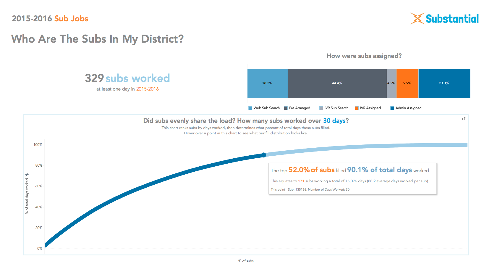
In this visualization we rank each sub by the number of days worked on the x-axis, then calculate the cumulative percent of total days worked up to that point in the chart on the y-axis - if every sub worked an equal number of days this chart would be a straight line from bottom-left to the top-right. The shape of this line tells us how equally days were distributed across subs - if the line climbs steeply at first and then quickly levels off, we know there was a more lopsided distribution of work amongst subtitutes with a select few carrying the load.
Substantial was also interested in knowing how many of their subs worked at least 30 days throughout the year - the brighter blue makes this distinction visually apparent, allowing us to get a general sense of the distribution of subs working above and below this threshold. Users can hover over this chart to see additional stats about the fill distribution at any given point in the graph (including this 30-day breaking point), learn who a specific sub is, or get more detail on how to interpret this visualization.

The Progress Monitor dashboard answers the question:
- How did my coverage rate and number of subs worked compare across different seasons of the school year?
Our final visualization takes the donut chart and number of subs worked visuals from the top half of our Sub Jobs Overview dashboard and allows us to look at how these statistics have changed throughout each season within a school year. Substantial refreshes these dashboards three times a year for their district partners, and wanted a simple view that allowed these partners to see back in time for their high-level metrics. This view allows leaders to see how their overall job requests and coverage rates have progressed through one school year, showing a snapshot of what these views from the first page showed during previous iterations of this report.
--Parsons--
Drawing Discrimination

Like this project? Want to get in touch? Reach out!